15 Oct 2026 · Brand Identity
Brand identity and logo design: how to build a brand people recognise from a distance
Logo, colour, typeface and attitude: what a brand identity project delivers, why you need an animated logo, how to derive a sub-brand and how to carry it into social media templates.
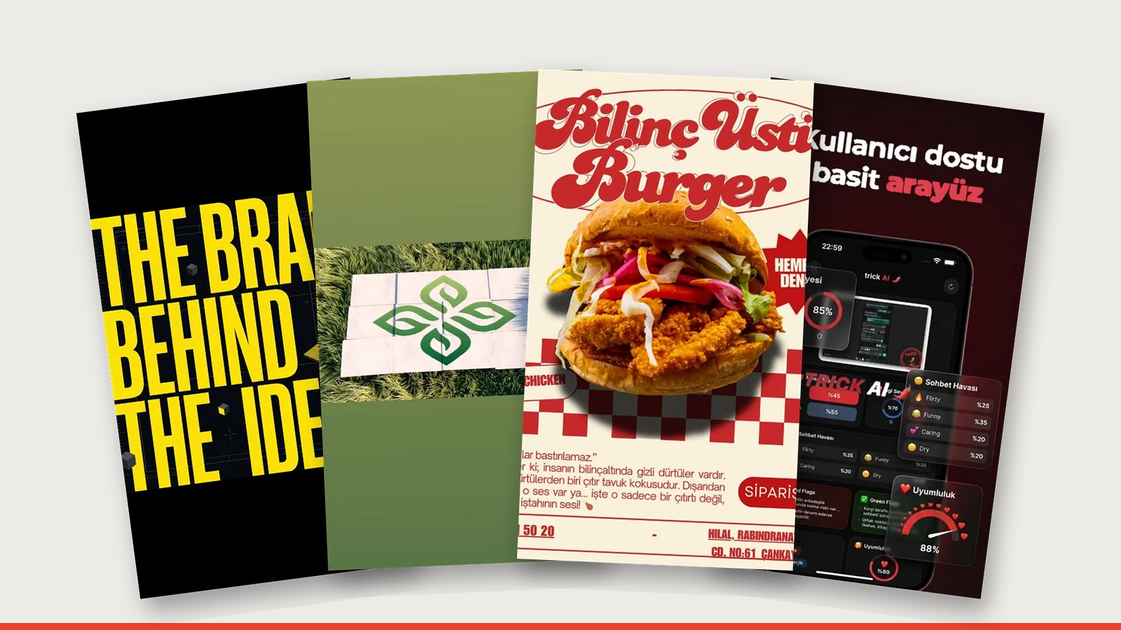
A brand identity is more than a logo: it's a system of logo, colour, typeface and attitude that looks the same everywhere. A good identity is born from one sentence ("Trust in the person behind the screen", for example), and that sentence is then turned into letters, colour and motion. Since identities now live on screens, an animated logo is a natural part of the delivery.
Identity starts with a sentence
The Digitune identity came from a single sentence: "Trust in the person behind the screen." We used heavy, condensed letters, a black background and a single signal colour. We told the idea of strategy and focus with 3D scenes, arrows breaking out of the crowd and giant typography; a mascot completed the identity.
What's in an identity package?
| Part | Description |
|---|---|
| Logo | Main logo, horizontal/vertical versions, icon, single colour |
| Colour | Main colour, accent colour, background colours (with codes) |
| Type | Heading and body typefaces |
| Animated logo | Video openers/closers, social media |
| Applications | Business card, social templates, presentation cover |
| Guidelines | Dos and don'ts |
Why you need an animated logo
Brands are now seen mostly on screens: Reels, ads, websites. For Smart Green House the logo opens and locks together on grass; the world turns and cities turn green. A complex topic like soilless farming was told with simple lines and a growing logo. The same green language carried through from the website to social media and to the sub-brand Vitaberry.
How to derive a sub-brand
You need a system that keeps the parent brand's language while giving the sub-brand its own personality: the same type family, the same attitude, a different accent colour or product world. The sub-brand stands on its own, but it's clear who it belongs to.
A character from your name
Sometimes the identity is hidden inside a joke. For Freud Chicken we turned the whole menu into a therapy session around a black-and-yellow round logo. In the Trick AI app, a dark background, red accents and a mascot robot gave a feel for the app's personality before install.
Process
- Intro: what the brand does, for whom, who the competitors are.
- Sentence: the one sentence the identity will rest on.
- First directions: 2–3 different visual directions.
- Development: the chosen direction is refined with logo, colour and type.
- Applications and animated logo.
- Delivery: all files and the guidelines.
Frequently asked questions
Can you refresh our existing logo?
Yes. To keep recognition, rather than starting from scratch we often simplify the existing logo and fit it into a system.
What files do you deliver?
Vector (SVG, PDF), PNG for screens, colour codes, typeface details, animated logo videos and the guidelines.
How is the identity carried into social media?
Post and story templates, highlight covers and the profile image are made together with the identity. For ongoing work: monthly social media management.
Do you design catalogues and packaging too?
Yes. Catalogues, packaging and product visuals are among the identity's applications: furniture catalogues and product visuals.
Related work
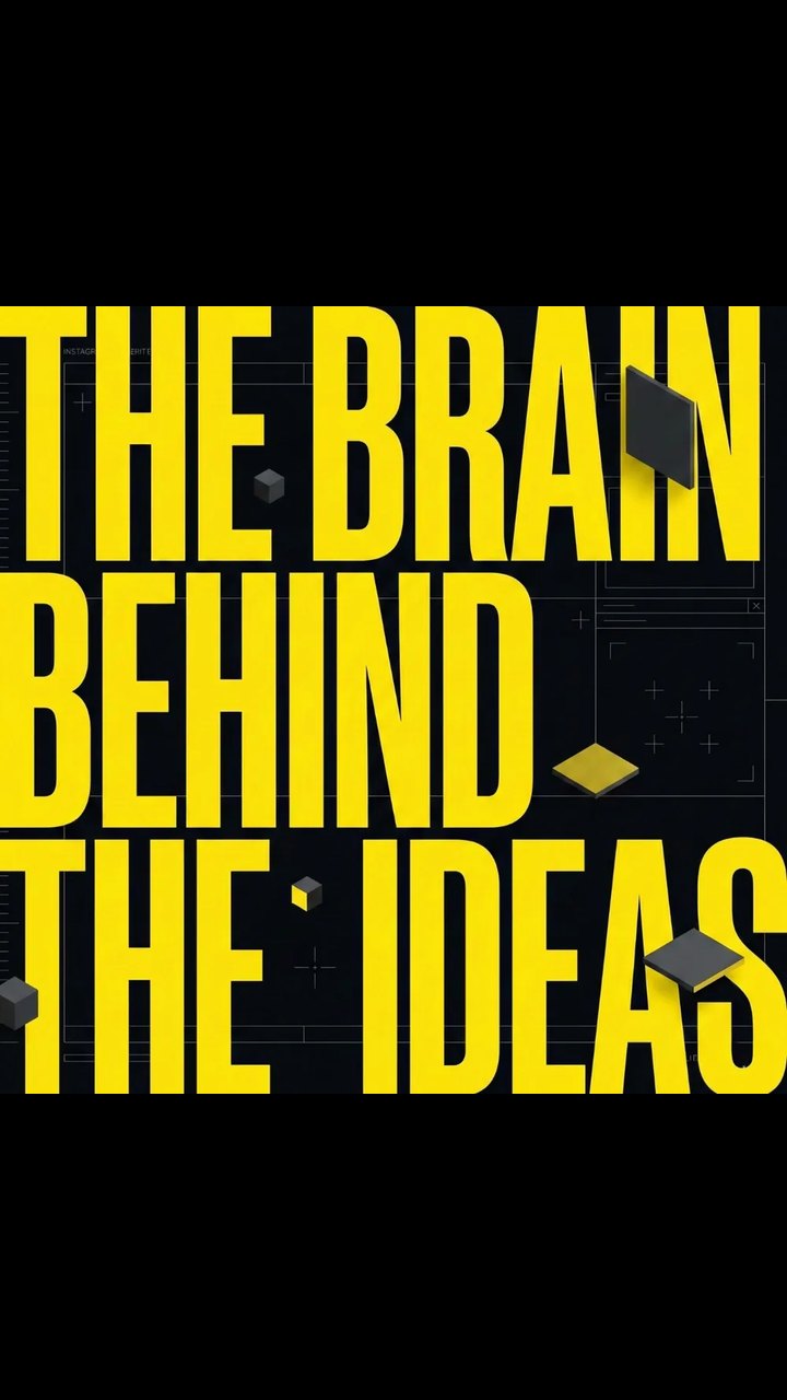

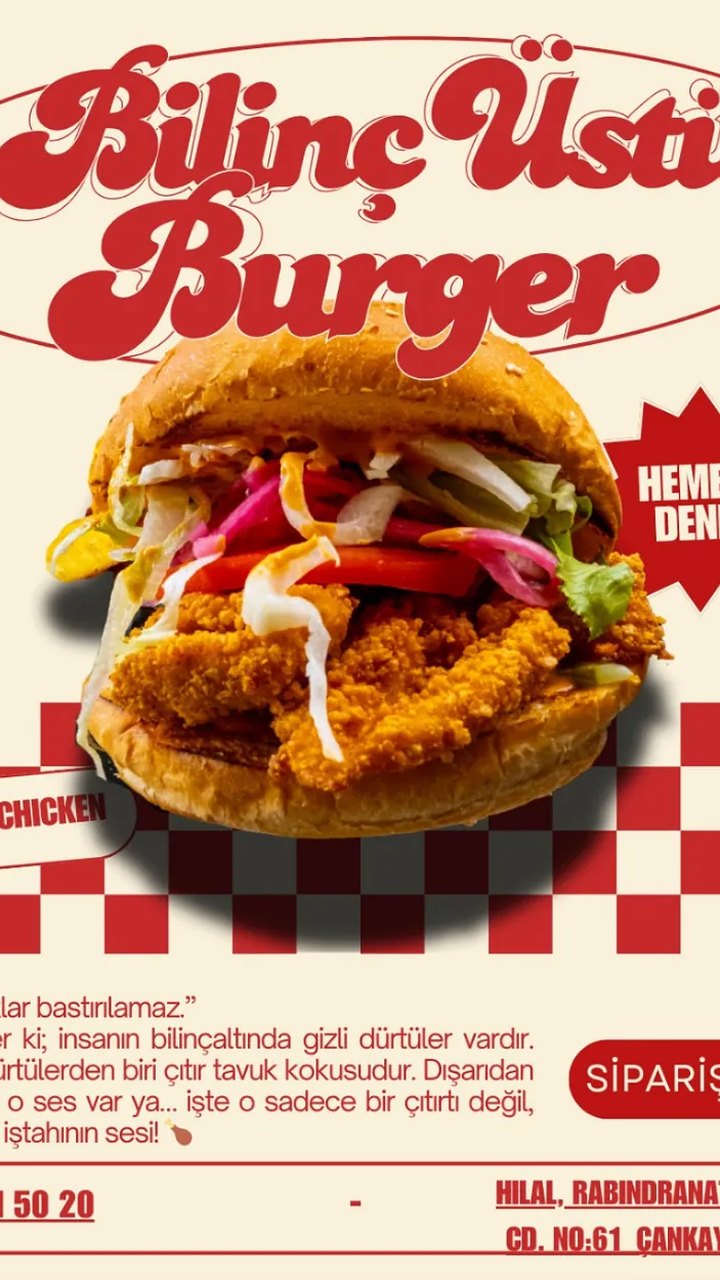
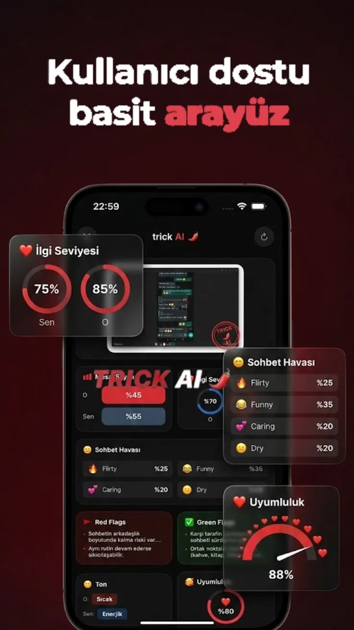
Be recognised before your name is read.
Write to us about identity ↗